배웠으면 적용을 해보는 것이 지식을 몸에 베게하는 가장 좋은 습관인 것 같다. Step 1의 마지막 내용으로 Google Clone이 있는데, Google 홈페이지가 Naver 처럼 복잡하지 않고 간단하다보니 비교적 배운 지식을 써먹기 좋을 것 같다.


일단 틀만 잡아보았다.

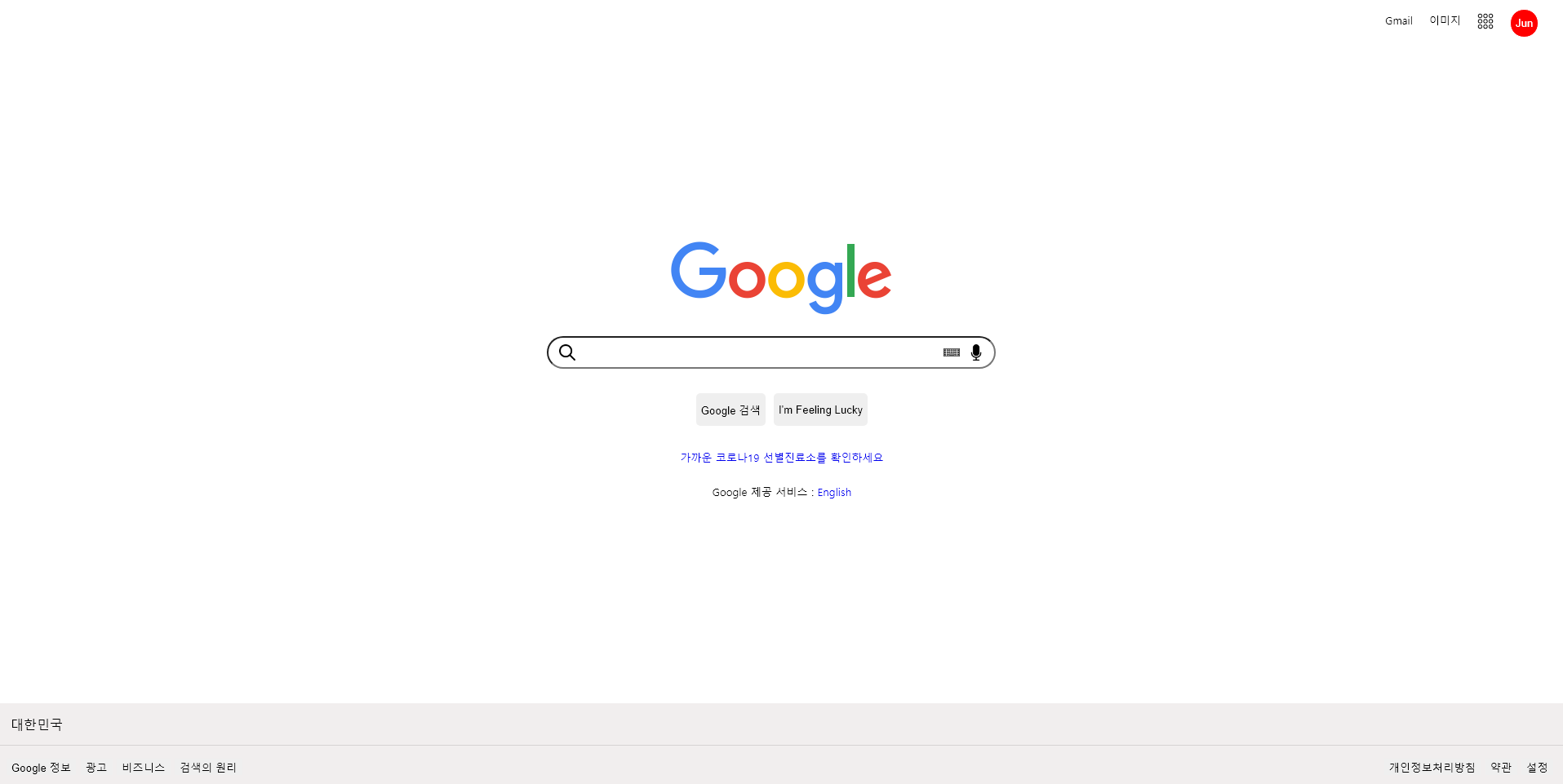
조금 어거지인 면도 있는 것 같은데 일단 시멘틱 구조를 최대한 적용해보고자 해당 사진처럼 구조를 잡았다. ㅎㅎㅎ


  • header - HTML
    <header>
      <div class="icon">
        <a href="#" class="icons gmail">Gmail</a>
        <a href="#" class="icons image">이미지</a>
        <a href="#" class="icons"
          ><img src="application.png" id="application"
        /></a>
        <button class="icons user">Jun</button>
      </div>
    </header>


gmail, icon, application, user를 '같이' 오른쪽 상단에 나란히 배치하기 위해 class="icon"의 div 태그에 포함시켰다. application은 flaticon에서 따왔다.

  •  header - CSS
      .icon {
        display: flex;
        justify-content: flex-end;
        margin-top: 10px;
        margin-right: 15px;
      }

      .icons {
        margin: 10px;
      }

      .gmail,
      .image {
        font-size: 13px;
        text-decoration: none;
        color: black;
      }

      .gmail:hover,
      .image:hover {
        text-decoration: underline;
      }

      #application {
        width: 20px;
      }

      .user {
        border: 1px solid white;
        border-radius: 100px;
        background-color: red;
        color: white;
        height: 35px;
        width: 35px;
        margin-top: 5px;
      }


class="icon"인 div 태그에 flex를 부여하고 justify-content: flex-end;를 통해 오른쪽 상단에 위치하도록 하였다. class="icons"인 div 태그들에게는 margin: 10px;를 줘서 서로 일정 간격 떨어지게 해주었다. gmail과 image는 링크 태그이지만 마우스를 갖다대지 않은 상태에선 밑줄이 안보기이게 text-decoration: none;으로 해주었다. 마우스를 갖다댔을 때는 밑줄이 생기기에 :hover를 이용하여 text-decoration: underline;을 부여해주었다.


개인적으로 user 모양(Jun의 글자가 들어간 빨간색 원 모양 icon)을 맞추는 것이 가장 어려웠다. 원의 특성상 지름이 어디서든 같기 때문에 height와 width를 똑같이 35px로 맞추고 border-radius: 100px;로 모서리를 없애 원을 만들었다.


  • section - HTML
        <section>
          <article>
            <div class="google-logo">
              <img
                src="https://www.google.com/images/branding/googlelogo/1x/googlelogo_color_272x92dp.png"
              />
            </div>
            <div class="searching-bar">
              <i id="magnifier"><img src="magnifier.png" /></i>
              <input type="search" />
              <i id="keyboard"><img src="keyboard.png" /></i>
              <i id="microphone"><img src="microphone.png" /></i>
            </div>
            <div class="rest">
              <button>Google 검색</button>
              <button>I'm Feeling Lucky</button>
            </div>
            <div class="covid">
              <a href="#" style="text-decoration: none"
                >가까운 코로나19 선별진료소를 확인하세요</a
              >
            </div>
            <div class="language">
              Google 제공 서비스 :
              <a href="#" style="text-decoration: none">English</a>
            </div>
          </article>
        </section>​
     

class="searching-bar"인 div 태그 안에 돋보기, input(search type), 키보드, 마이크를 넣었다.


  • section - CSS
      .google-logo {
        margin-top: 240px;
        text-align: center;
      }

      .searching-bar {
        margin-top: 20px;
        text-align: center;
      }

      .searching-bar img {
        width: 20px;
      }

      .searching-bar input {
        border-radius: 45px;
        width: 550px;
        height: 40px;
      }

      #magnifier {
        position: relative;
        top: 5px;
        left: 40px;
      }

      #keyboard,
      #microphone {
        position: relative;
        top: 5px;
        right: 65px;
      }

      #keyboard {
        right: 70px;
      }

      .rest,
      .covid,
      .language {
        margin-top: 25px;
        text-align: center;
        font-size: 13px;
      }

      .rest {
        display: flex;
        justify-content: center;
      }

      .rest button {
        border: none;
        border-radius: 5px;
        height: 40px;
        margin: 5px;
      }

google-logo는 header와 240px 만큼의 상단 마진이 남게 해주어 차이를 주었고 text-align을 통해 중앙에 배치하였다. searching-bar 또한 text-align을 통해 중앙에 배치시켰고, searching-bar img { width: 20px; }를 통해 class="searching-bar"인 div 태그 안의 img 태그들의 크기는 20px로 통일시켰다.(돋보기, 키보드, 마이크의 크기가 20px이 된 셈이다) 그리고 돋보기와 키보드, 마이크에 position: relative;를 부여해 searching-bar 안에 들어오도록 조정했다. 이 때 이 3개의 이미지는 부모 태그인 <div class="searching-bar">를 기준으로 위치가 정해진다.


  • footer - HTML
    <footer>
      <div class="country">대한민국</div>
      <div class="realfooters">
        <div class="realfooter">
          <button>Google 정보</button>
          <button>광고</button>
          <button>비즈니스</button>
          <button>검색의 원리</button>
        </div>
        <div class="realfooter2">
          <button>개인정보처리방침</button>
          <button>약관</button>
          <button>설정</button>
        </div>
      </div>
    </footer>

Google 정보, 광고, 비즈니스, 검색의 원리 이 4개와 개인정보처리방침, 약관, 설정은 이 3개는 각각 오른쪽, 왼쪽에 배치되기 때문에 나누어서 div 태그에 담아주었다.(realfooter : 4개, realfooter2 : 3개)


  • footer - CSS
      footer {
        background-color: rgb(241, 238, 238);
        width: 100%;
        position: fixed;
        bottom: 0;
        left: 0;
      }

      .country {
        border-bottom: 1px solid rgb(214, 211, 211);
        padding-top: 15px;
        padding-bottom: 15px;
        padding-left: 15px;
      }

      .realfooters {
        padding-top: 15px;
        padding-bottom: 15px;
        padding-left: 10px;
        display: flex;
      }

      .realfooters button {
        border: none;
      }

      .realfooters button:hover {
        text-decoration: underline;
      }

      .realfooter2 {
        position: absolute;
        right: 15px;
      }

footer가 화면에서 맨 밑에 나오도록 position: fixed;를 부여하고 bottom: 0;와 left: 0;을 부여했다. 3개의 항목으로 이루어진 realfooter2는 display: flex;가 부여되어 있기 때문에 realfooter와 나란히 배치되고 position: absolute와 right: 15px 를 통해 오른쪽에 배치된다.


완성본!

생각보다 비슷하게 만든 것 같다!


하지만 해결하지 못한 문제점도 있다.

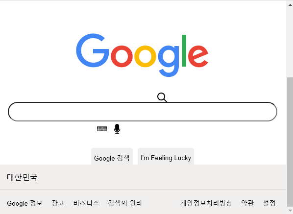
보다시피 크기가 줄어들면 searching-bar 안의 이미지들이 엇나가기 시작한다... CSS를 좀 더 이용해보고 언젠가 다시 해보아야겠다.


그래도 Google 홈페이지를 Clone하면서 flex, margin, position에 대해 더 자세히 검색하면서 익숙해질 수 있었다.


참고 출처 : https://velog.io/@shanells/Google-clone-coding

'프로그래밍 > 바닐라코딩_Prep Guide' 카테고리의 다른 글

Step 2. JavaScript(2)  (0) 2021.11.25
Step 2. JavaScript(1)  (0) 2021.11.24
Step 1. CSS  (0) 2021.11.02
Step 1. HTML  (0) 2021.10.29
준비를 위한 준비  (0) 2021.10.28

출처 : 바닐라코딩 Prep Guide

위와 같이 HTML은 구조를 결정하는 한편, CSS는 그 날 것의 구조를 꾸미는 것이고, JavaScript는 꾸며진 구조가 동적으로 움직일 수 있게 해준다.


  • CSS
<!DOCTYPE html>
<html lang="ko">
  <head>
    <style>
      h1 {
        color: black;
        font-size: 30px;
        font-weight: 1500;
      }

      li,
      p {
        color: blue;
        font-size: 30px;
      }

      #firstList {
        font-size: 20px;
      }
    </style>
  </head>

  <body>
    <h1>바닐라코딩</h1>
    <ul>
      <li id="firstList">HTML</li>
      <li>CSS</li>
      <li>JavaScript</li>
    </ul>
    <p>한 번 끝까지 달려보자!</p>
  </body>
</html>

위 코드에서 head의 style 태그 안에 담긴 것들이 CSS이다. 단순히 h1, li, p와 같은 태그들을 선택할 때는 그대로 입력 후 중괄호 {} 안에 원하는 CSS를 기입하면 된다. id를 선택할 때에는 앞에 #을 붙여주어야 한다. 또한, CSS는 각 코드의 끝에 세미 콜론 ;을 붙여주어야 한다.


참고로 id나 class를 정해줄 때 위와 같이 firstList처럼 이름을 정해주는데, 이 때 대부분의 개발자들이 사용하는 규칙이 있다. first list처럼 쓰는 것이 아닌, _을 활용한 first_list앞 단어 이후 붙는 뒤의 단어들의 첫 번째 글자는 대문자로 시작하는 firstList로 이름을 정해준다.


  • Selectors, 선택자
<!DOCTYPE html>
<html lang="ko">
  <head>
    <style>
      * {
        font-family: Arial, Helvetica, sans-serif;
      }

      h1 {
        color: black;
        font-size: 30px;
        font-weight: 1500;
      }

      /* li,
      p {
        color: blue;
        font-size: 30px;
      } */

      #firstList {
        font-size: 20px;
      }

      .thick {
        font-weight: bold;
      }

      .alert {
        color: red;
      }

      #box {
        background: blue;
        color: white;
      }

      #nav li {
        background: blue;
        color: black;
      }

      #list > li {
        border: 1px solid black;
        color: blue;
      }

      img[alt="cat"] {
        border: 1px solid black;
      }
    </style>
  </head>

  <body>
    <h1>바닐라코딩</h1>
    <ul>
      <li id="firstList">HTML</li>
      <li>CSS</li>
      <li>JavaScript</li>
    </ul>
    <p>한 번 끝까지 달려보자!</p>

    <hr />

    <p class="thick">나는 두꺼워, I'm thick</p>
    <p class="alert">경고, Warning!</p>
    <p id="box">나는 박스야, I'm box</p>

    <h1>Heading</h1>
    <h2>SubHeading</h2>

    <ul id="nav">
      <li>child</li>
    </ul>

    <hr />

    <ul id="list">
      <li>child</li>
      <li>
        <ul>
          <li>grand child</li>
        </ul>
      </li>
    </ul>

    <hr />

    <img
      src="https://i.guim.co.uk/img/media/26392d05302e02f7bf4eb143bb84c8097d09144b/446_167_3683_2210/master/3683.jpg?width=465&quality=45&auto=format&fit=max&dpr=2&s=68615bab04be2077a471009ffc236509"
      alt="cat"
    />
  </body>
</html>

h1, p, li와 같은 태그들은 그대로 적어주면 지정할 수 있다.


thick과 같은 class의 경우는 앞에 .을 붙여주어야 한다. class의 경우, id와 달리 하나 이상의 요소에 class를 부여할 수 있다. 또한 class명을 thick_alert 혹은 thickAlert가 아닌 thick alert로 지었을 경우, style에 작성한 thick과 alert의 영향을 동시에 받는다.


id는 앞에 #을 붙여주면 되고, 하나의 id명에는 하나의 HTML 요소만 적용하는 것이 원칙이다.


li, p처럼 쉼표를 이용해 2개 이상을 동시에 지정할 수 있다.(Compound)


#nav li, #list > li 처럼 한 요소의 하위 요소를 선택할 수도 있다.


*을 이용하면 HTML body의 모든 요소를 선택하게 된다.


img[alt="cat"]으로 지정하면, img 태그 중 alt 속성의 값이 cat인 HTML 요소를 선택하게 되는 것이다.


※ 반드시 기억해야 하는 CSS 선택자 30개 : https://programmers.co.kr/learn/courses/30/lessons/12948


  • CSS Layout

   1. Block and Inline Block Elements

Block 요소들은 줄바꿈이 실행되어 새로운 줄에서 시작한다. 대표적으로 p와 div 태그가 있다. Block은 Block이나 Inline을 자식으로 품을 수 있다.


반면 Inline 요소들은 줄바꿈이 실행되지 않아, 새로운 줄에서 시작하지 않는다. 텍스트 흐름과 동일하게 동작한다. 하나에 이러 또 다른 하나가 줄줄이 이어 붙여진다는 것이다. Inline은 Inline을 자식으로 품을 수 있지만, Block은 자식으로 품을 수 없다. Inline의 대표적인 태그로는 span이 있다.


   2. Flex

<!DOCTYPE html>
<html lang="ko">
  <head>
    <title>HTML & CSS</title>
    <style>
      .main {
        display: flex;
      }

      code {
        background: #000000;
        color: #ffffff;
        display: block;
        padding: 25px;
        text-align: center;
      }

      header,
      section,
      aside,
      footer {
        margin: 10px;
      }

      footer {
        margin-bottom: 0px;
      }
    </style>
  </head>
  <body>
    <header>
      <code>&#60;HEADER&#62;</code>
    </header>

    <div class="main">
      <section>
        <code>&#60;SECTION&#62;</code>
      </section>

      <aside>
        <code>&#60;ASIDE&#62;</code>
      </aside>
    </div>

    <footer>
      <code>&#60;FOOTER&#62;</code>
    </footer>
  </body>
</html>

class가 main인 요소의 display를 flex로 두면 다음과 같이 2개 이상의 요소를 나란히 배치할 수 있다.


   3. Using Inline Block


위와 같이 2개 이상의 요소를 나란히 배치할 수 있는 방법이 1가지 더 있다.

section,
aside {
    display: inline-block;
}

Flex를 사용했을 때와 유사하나, Section과 Aside간의 간격이 조금 벌어져 있다.

Flex와 Inline Block은 외형은 비슷하게 나오나 코딩은 조금 다르게 해야 한다. Flex의 경우 class가 main인 요소를 선택해 display: flex;를 부여하면 자식 요소들이 나란히 배치된다.


이와 다르게 Inline Block은 나란히 배치하고 싶은 요소들, 이를테면 위처럼 section, aside를 하나하나 지정해주어야 한다.


  • Using Position Property

   - Static : 기본 위치로, Position Property를 따로 지정하지 않았을 때 Static이 기본 상태이다. 좌표 Property인 top, bottom, left, right를 사용할 수 없고 사용할 때에는 무시된다. 


   - Relative : position: relative;를 부여한다고 해서 딱히 어느 위치로 이동하진 않는다. 하지만 좌표 Property를 부여해 원래의 위치에서 이동시킬 수 있다.

.relative-element {
     background: #ffffff;
     border: 2px dashed red;
     height: 100px;
     padding: 0;
}

.relative-element code {
     background: blue;
     color: #ffffff;
     display: block;
     height: 74px;
     left: 20px;
     padding-top: 26px;
     position: relative;
     text-align: center;
     top: 20px;
}

빨간색 점선 박스로부터 위에서 20px, 왼쪽에서 20px 벗어난 파란색 박스를 볼 수 있다. relative-element는 Position Property를 부여하지 않았기 때문에 이동할 수 없는 Static 상태일 것이고, relative-element라는 부모 안의 자식 요소인 code, 즉 <div class="relative-element">는 relative라는 Position Property를 부여받아 top이나 left라는 좌표 Property에 의해 이동할 수 있다.


relative의 경우 기본 위치는 static이고 부모를 기준으로 두고 이동하게 된다.


   - Absolute : 가장 가까운 부모 요소 중 position: relative;가 적용된 요소를 찾아, 그 요소를 기준으로 위치가 정해지게 된다. 만약 부모 요소 중 position: relative;를 가진 요소가 없다면, 전체 페이지를 기준으로 위치를 잡게 된다.

section {
  background: #000000;
  height: 145px;
  position: relative;
}

.absolute-element,
.absolute-element code {
  height: 96px;
  position: absolute;
  width: 160px;
}

.absolute-element {
  border: 2px dashed red;
  right: 0;
  top: 0;
}

.absolute-element code {
  background: blue;
  color: #ffffff;
  display: block;
  right: 20px;
  top: 20px;
}

position: relative;가 부여된 section을 기준으로, class가 absolute-element인 div 요소(빨간색 점선)는 rigth: 0, top: 0;으로 위와 오른쪽 공백 없이 맨 오른쪽에 위치하게 되었다.


class가 absolute-element인 div의 자식인 code(파란색 박스)는 section을 기준으로 오른쪽으로부터 20px, 위로부터 20px 공간을 두고 위치하게 된다.


도움이 될만한 자료, CSS Layout 학습 : https://ko.learnlayout.com/toc.html


Prep Guide를 학습하다보면 이처럼 참고 자료가 많이 나온다. 이해하기 쉽고 유익한 자료이나, 하나를 깊게 파고들다보면 앞으로 나아가기 힘들고 흥미 또한 떨어질 수 있기 때문에, 나중에 개인 프로젝트를 진행하다 벽을 마주쳤을 때 필요한 내용들을 되짚어 봐야겠다.

'프로그래밍 > 바닐라코딩_Prep Guide' 카테고리의 다른 글

Step 2. JavaScript(1)  (0) 2021.11.24
Step 1. Google Clone  (0) 2021.11.14
Step 1. HTML  (0) 2021.10.29
준비를 위한 준비  (0) 2021.10.28
또다른 입구  (0) 2021.10.27

+ Recent posts